


Your Website Is Not Your Deck: Why More Information Can Weaken Your Brand
A common website strategy mistake is treating a website like a pitch deck.
The thinking is understandable: your company has a process, capabilities, technology, services, differentiators, use cases, proof points and a story worth telling. If all of that information matters, why not put it all on the website?
Often, most of it ends up on the homepage.
The result is a website that technically says everything but communicates very little.
Your website is not your deck.
A pitch deck is a guided story. Information can unfold slide by slide, and a presenter can add context as the audience moves through it. A website has a different job. Visitors arrive with different questions, different levels of awareness and different intentions. They scan, jump between pages and decide quickly whether a company is relevant enough to explore further.
A strong website does not need to explain everything at once. It needs to communicate the right information, in the right place, at the right time.
Can Too Much Information on a Website Hurt Your Brand?
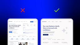
Yes. Too much poorly prioritized information can hurt both website usability and brand perception. When every message, service, feature and differentiator competes for attention, visitors have to figure out what matters on their own.
An overloaded website can make a sophisticated company feel complicated. Too many competing messages can make positioning feel unclear. Explaining every detail before the visitor understands the main idea can make a brand appear less confident about what it stands for.
In that sense, content density becomes a brand signal.
Strong brands make choices. They know what is most important, what deserves emphasis, what can wait until a deeper page and what does not need to be said at all.
This is especially important for companies trying to move upmarket or become enterprise-ready. A business may have deep expertise, sophisticated technology and dozens of capabilities. But presenting all of them with equal weight does not automatically make the company look more capable. It can make the experience feel less mature because the audience cannot identify the central value proposition.
Complexity can exist behind the scenes. The brand experience should still feel clear.
What Is the Job of a Business Website?
The primary job of a business website is to help the right visitor quickly understand what the company does, who it serves, why it is relevant, why it is credible and what to do next.
At a high level, a website should answer six questions:
- Who are you?
- What do you do?
- Who is it for?
- What problem do you solve or what outcome do you create?
- Why should someone choose or trust you?
- What should the visitor do next?
Everything else should support those answers instead of competing with them.
This is why website content strategy is as much about prioritization and editing as it is about writing. The right question is not, What information does our company have? The better question is, What does this visitor need to understand on this specific page?
What Should Be on a Homepage?
A homepage should communicate the clearest version of the company story. It should help a visitor understand the business at a high level and give them clear paths to more specific information.
In most cases, a strong homepage should include:
- A clear statement of what the company does and who it helps
- The primary problem, need or opportunity the company addresses
- A concise overview of core services, products or solutions
- The most meaningful differentiators
- Proof such as clients, outcomes, case studies, testimonials, certifications or partnerships
- Clear links to deeper, topic-specific pages
- One primary call to action and, when useful, one secondary action
A homepage should create orientation, relevance and trust. A visitor should not have to read thousands of words before understanding the business.
What Should Be on a Services Page?
A core Services page should explain what the company offers, how the main services differ and where a visitor can learn more. Its purpose is to establish the service architecture, not to reproduce every individual service page in one long scroll.
If a company offers five distinct services, the main Services page can introduce the value and purpose of each one, then link to five dedicated service pages. Those individual pages can go deeper into deliverables, process, use cases, outcomes, FAQs and supporting proof.
This creates a better experience for both broad and high-intent visitors. Someone exploring the company gets a clear overview. Someone researching one particular service can go directly to the detail they need.
What Should Be on a Why Us Page?
A Why Us page should answer one central question: why should a customer choose this company instead of another option?
Focus on meaningful differentiation rather than trying to summarize the entire website again. Depending on the business, strong differentiators might include:
- Specialized expertise
- A proprietary methodology or technology
- A noticeably better customer experience
- Faster or more efficient delivery
- Measurable business outcomes
- Industry-specific knowledge
- A combination of capabilities competitors cannot easily replicate
A Why Us page should strengthen the decision to choose you. It should not become a second About page, another Services page and a full company history at the same time.
Where Should Detailed Website Information Go?
Detailed information belongs on deeper pages organized around a specific topic, audience or search intent. Moving information away from core pages does not mean removing useful content from the website. It means giving that content the right home.
Detailed information can live on:
- Individual service pages
- Product and feature pages
- Industry pages
- Use-case pages
- Case studies
- Process or methodology pages
- Integration pages
- Pricing or engagement-model pages
- Comparison pages
- Resource centers
- FAQ pages
- Technical documentation
- Blog articles and educational guides
This layered structure lets every visitor choose the depth they need. A first-time visitor can understand the brand quickly. A prospective customer can investigate a specific service. A technical buyer can access detailed specifications without forcing everyone else to read them first.
The goal is not less information. The goal is better information architecture.
What Should Not Be on Your Core Website Pages?
The problem is not detailed content itself. The problem is information that is unnecessary, repetitive, poorly prioritized or placed on a page where it distracts from the visitor’s main decision.
1. Internal Language Your Customers Do Not Use
Internal terminology, organizational language and proprietary labels may make sense to your team but mean very little to a new visitor. Use the language customers use to describe their problems, goals and needs. Introduce branded terminology only when it adds real meaning.
2. Every Feature Presented as Equally Important
When everything is highlighted, nothing feels important. Lead with the capabilities that most influence the customer’s decision. Secondary features can live on product, service or feature pages where visitors can explore them in context.
3. Repetitive Messaging
Repeating the same claim in multiple homepage sections does not necessarily make the claim stronger. It often makes the website longer without making the value proposition clearer. Each section should add a new layer of understanding, proof or direction.
4. A Long Company History Before Establishing Relevance
Your story can build trust, but visitors usually need to understand what you can do for them before they need the complete story of how the company began. Put the fuller narrative on the About page and use only the most relevant credibility points on core conversion pages.
5. Every Possible Audience on One Page
Trying to speak simultaneously to startups, enterprise buyers, investors, partners, technical teams, marketers and procurement can dilute the message for everyone. When audiences have meaningfully different needs, create clear pathways and dedicated pages for them.
6. Information That Does Not Help a Visitor Make a Decision
Before adding content to a core page, ask what it helps the visitor understand, trust, compare or do. Information should earn its place. If it answers a secondary question, move it deeper into the site rather than forcing it into the primary journey.
A Website Should Have Depth Without Feeling Dense
There is an important difference between a simple website and a clear website.
The goal is not to strip a site down until it says almost nothing. Minimal pages filled with vague headlines and unsupported claims can be just as ineffective as overloaded pages.
A strong website can contain substantial depth without presenting all of that depth at once.
Think about information in layers. The first layer communicates the core idea. The next layer adds context, differentiation and proof. Deeper pages answer specific questions for people who need more detail.
This creates a website that feels simple without being simplistic.
Do You Need a Lot of Website Content for SEO?
No. More words do not automatically create stronger SEO. Core pages need enough useful, indexable content to clearly explain the business, but forcing every keyword, service and explanation onto a homepage is not a strong content strategy.
A better approach is to create a clear website architecture around distinct topics and search intent.
For example, instead of trying to make one homepage rank for every service and every customer need, build focused supporting pages. A dedicated service page can fully explain one offering. An industry page can address the needs of one market. A comparison page can support visitors evaluating alternatives. A case study can demonstrate a specific outcome. A useful article can answer an informational question in depth.
This approach creates clearer topical relationships across the website while giving search visitors a landing page that closely matches what they were looking for.
How Should a Website Be Structured for AI Search?
For AI search and answer engines, prioritize clear topics, direct answers, descriptive headings, consistent terminology, useful evidence and strong relationships between pages.
AI optimization is not about repeating the same keyword as many times as possible. It is about making the company’s expertise and information easier to interpret.
Useful practices include:
- Create one clear primary purpose for each important page
- Use descriptive headings that reflect real customer questions and topics
- Answer important questions directly before adding supporting explanation
- Use consistent names for services, products, audiences and areas of expertise
- Support claims with case studies, outcomes, credentials, examples and original expertise where available
- Build dedicated pages for important services, industries, use cases and questions
- Use internal links to make relationships between related topics explicit
- Keep company, service and expertise information accurate and consistent across the site
- Add structured data when it accurately represents content that is actually visible on the page
If every service, audience, benefit, feature and use case is compressed into one giant page, the website may contain a lot of information while making individual concepts harder to distinguish.
For AI visibility, think beyond more content. Think clear entities, clear topics, clear answers and credible supporting detail.
Your Website and Your Deck Have Different Jobs
A sales deck can be comprehensive because its narrative is controlled. The presenter often knows the audience, the context and the stage of the conversation. One slide can introduce an idea and the next can expand it.
A website has to work without that guide.
Visitors may arrive through the homepage, but they may also land directly on a service page through Google, an AI-generated answer, a referral, an advertisement or a shared link. Each page needs enough context to make sense on its own while guiding the visitor to the logical next step.
That is why copying a pitch deck into a website rarely creates a strong digital experience.
The deck says: Here is the whole story.
The website says: Here is what matters to you right now, and here is where to go next.
How Do You Know If a Website Page Has Too Much Information?
Before adding another content block to a homepage, Services page or Why Us page, ask:
- Does the visitor need this information at this stage?
- Does it make the main message clearer or compete with it?
- Is it new information, or does another section already say the same thing?
- Would the information be more useful on a dedicated deeper page?
- Does it help someone understand, trust, choose or take action?
If the content does not help the page perform its specific job, it probably belongs somewhere else.
Clarity Is Part of the Brand
The strongest websites do not feel impressive because they contain the most information. They feel impressive because the information has been considered, prioritized and presented with purpose.
That restraint communicates something important about the business: we know what we do, we know who it is for and we know what matters.
Your website should have depth. It should answer serious questions. It should support SEO, AI discovery, sales and customer decision-making. But it does not have to do all of those things in the same place at the same time.
Your website is not your deck.
It is a connected system of pages, each with a specific job. When every page does that job well, the entire brand feels clearer, stronger and easier to trust.
Frequently Asked Questions
How much information should be on a homepage?
A homepage should include enough information for visitors to understand what the company does, who it serves, why it is different, why it is credible and what to do next. Detailed information should be linked through to relevant service, product, industry, case study or resource pages.
Can too much content hurt a website?
Yes. Excessive or poorly prioritized content can make important messages harder to find and can make a company appear unfocused or unnecessarily complicated. The issue is not simply word count. The bigger issues are hierarchy, relevance and whether the content helps the visitor make a decision.
Is a long homepage bad for SEO?
Not necessarily. A long homepage can perform well when its content is useful, relevant and well structured. However, adding more copy does not automatically improve SEO. Focused supporting pages are often a better place to cover individual services, industries, questions and search intents in depth.
What content should go on separate website pages?
Detailed service information, product features, industry content, specific use cases, case studies, technical information, FAQs, comparisons, resources and educational content often work better on dedicated pages. This allows core pages to stay focused while the overall website still provides depth.
What should be on a business website?
A business website should clearly explain what the company does, who it helps, what problems it solves, why it is different, why visitors should trust it and what action to take next. Supporting pages should provide deeper information for specific services, audiences, use cases and customer questions.
How should a website be structured for AI search?
A website designed for AI discovery should use focused pages, descriptive headings, direct answers, consistent terminology, strong internal linking and credible supporting evidence. Important services, audiences, use cases and areas of expertise should have clear, context-rich content rather than being compressed into one overloaded page.

How to Choose a Branding Agency in Los Angeles
Choosing a branding agency in Los Angeles starts with understanding what you actually need from the relationship. Some companies need a new logo and visual identity. Others need deeper work: brand strategy, positioning, messaging, naming...
0 Comments1 Minute

Enterprise-Ready Branding: How to Build a Brand and Website That Scale
Startups can grow faster than their brands. A company may gain customers, improve its product, raise capital, and begin pursuing larger opportunities while its brand still looks and sounds like an early-stage startup. That gap becomes especially important when...
0 Comments13 Minutes

Are You a Leader or Follower? The Hidden Cost of AI Slop in Branding
AI slop is rapidly becoming one of the biggest problems in modern branding and digital product design. As more founders, startups, and managers use AI tools to launch websites, products, ads, and brands, the internet is becoming flooded with repetitive visuals, generic messaging...
0 Comments8 Minutes
