Logo Doesn’t Need to Explain What You Do – It’s How People Recognize and Remember Your Brand
Logo design is often misunderstood. Many founders want a logo that shows every service they offer – moving, plumbing, coaching, real estate, you name it. But the job of a logo isn’t to explain your catalog; it’s to create instant recognition. A strong logo design gives people a simple visual anchor so they can remember you quickly and find you again across channels.
Think about the brands you know best. Their logo design is simple, distinctive, and used consistently. It’s not a brochure or an illustration of every capability. Instead, it’s a recognition system – a mark that becomes meaningful through repeated exposure paired with consistent messaging and customer experience.
Recognition Over Explanation
Attempting to pack “what you do” into a logo usually leads to clutter. When a mark tries to depict five services, three values, and a mission statement, it becomes visually noisy and forgettable. Great logo design focuses on recognition: a clear, distinctive form that’s easy to spot at a glance and easy to remember later.
- Distinctiveness: Your logo design should look like your brand and nobody else’s. Unique silhouettes and negative-space decisions beat literal drawings of products.
- Clarity: Simple forms read faster. Fast reading = faster recognition. Faster recognition = stronger memory.
- Repetition: The meaning of a logo accrues through consistent use across touchpoints over time.
Logos Are Functional Tools, Not Artifacts of Description
A logo is a tool. The most effective logo design behaves well in real life: on websites, social posts, ads, signage, packaging, merchandise, and app icons. That means it must be simple, scalable, and robust in one color as well as full color. Decorative details that look nice at 1200px often collapse at 16px. Function beats ornamentation.
Functional Criteria for Strong Logo Design
- Works in one color and on dark/light backgrounds
- Scales from favicon to billboard without losing legibility
- Retains a recognizable silhouette (squint test)
- Performs in raster and vector workflows
- Has variants (primary, horizontal, mark-only) with documented usage
A Logo Doesn’t Create Sales By Itself – Consistency Does
No logo design can move revenue on its own. What moves revenue is the system: consistent visuals, clear positioning, memorable messaging, reliable service, and repeatable experiences. Your logo is the anchor, but the brand system – color, typography, photography, layout, voice, and the promise you keep – does the heavy lifting. When people see the same mark paired with a consistent story in email, on the website, in social content, and in your proposals, trust compounds. That trust is what converts.
How Logos Actually Build Brand Equity
- Attention: A distinctive logo design catches the eye in crowded feeds and search results.
- Association: Repeated pairings of the logo with benefits, outcomes, and experiences create meaning.
- Memory: Simplicity helps the logo stick. People recognize you faster the next time.
- Preference: Familiarity reduces perceived risk and nudges buyers toward your brand.
Common Objections – Answered
“Our services are complex. We need to show them in the logo.” Complex services are explained by messaging, pages, and sales conversations – not by the logo design. The logo’s job is to be the consistent signpost that points to those explanations.
“If we change the logo, will we confuse customers?” If your logo is evolving, communicate clearly and roll it out consistently. People adapt quickly when the system is coherent and the experience improves.
“Won’t a simple logo look generic?” Simple doesn’t mean generic. Distinctive geometry, spacing, angles, and proportions create uniqueness without clutter. The surrounding system (color, type, voice) amplifies that uniqueness.
Practical Tests for Your Logo Design
- Favicon test: Reduce to 16×16px. Is it still recognizable?
- Monochrome test: Flatten to one color. Does it hold?
- Silhouette test: Fill as solid black. Is the outline distinctive?
- Contrast test: Place on photos and flat colors. Does it read?
- Distance test: Step back 10 feet from a printout. Can you still identify it?
Build Consistency Across Touchpoints
Consistency is a multiplier. Pair your logo design with a style guide: color values, type scales, spacing rules, grid usage, and do/don’t examples. Align the logo with messaging pillars and a clear value proposition. Use the same voice across website, ads, email, proposals, decks, and packaging. Over time, this integrated approach makes your brand unmistakable – even when the logo isn’t visible.
What to Focus On Instead of Literal Illustration
- Positioning: Clarify who you serve and why you’re different.
- Messaging: Create repeatable headlines and proof points.
- Design system: Document color, type, layout, and components.
- Content consistency: Reuse structures across channels for faster recognition.
- Operational consistency: Deliver the same quality experience every time.
Bottom Line
Your logo design doesn’t need to explain your services. It needs to be recognized, remembered, and reliably deployed. Distinctiveness, simplicity, and scalability make the logo effective. Consistency across your entire brand system makes the business grow.
FAQ
Should my logo show everything my company does?
No. The logo’s job is recognition. Use your website, sales pages, and content to explain services. Keep the logo design simple and memorable.
Can a logo alone increase revenue?
A logo alone doesn’t drive sales. Consistent branding, clear messaging, and reliable delivery do. The logo design is the anchor that ties those elements together.
What makes a logo functional?
Simple forms, distinctive silhouette, scalability, and performance in one color. A functional logo design works everywhere without loss of clarity.
How do I keep my brand consistent?
Create a documented system (style guide), align messaging with visuals, and apply the same rules across all touchpoints. Consistency makes your logo stronger over time.
When should I refresh my logo?
Refresh when the mark no longer serves functional needs, is too complex for modern channels, or conflicts with updated positioning. Keep evolution purposeful and consistent.
Work With Pill Creative Studio
Need a distinctive, scalable, and functional logo design – and a system to use it consistently? Pill Creative Studio builds brand identities that people recognize and remember.
SEO vs AI Optimization: What’s the Difference?
Business,Web Design,AI Overviews,AIAI Optimization
March 27, 2026
SEO and AI optimization are often mentioned together, but they are not the same thing. Search engine optimization helps your website rank in traditional search results. AI optimization helps your business appear in AI-generated answers, summaries, and recommendations.
0 Comments10 Minutes
How to Find the Best SEO and AI Optimization Agency
Web Design,AI Overviews,AI,AI Optimization,SEO Optimization
March 25, 2026
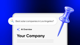
Finding the right SEO and AI optimization agency is no longer optional. If your brand does not appear in Google results or AI-generated answers, you are invisible when buyers are ready to act. This guide explains how to evaluate agencies and choose a partner that improves both discoverability and conversion.
0 Comments4 Minutes
How to Align Your Brand, Website, and Content for Growth
Branding,Web Design,AI OverviewsAI
March 23, 2026
To align your brand, website, and content for growth, you need a clear brand strategy, a website that communicates it effectively, and content that consistently reinforces it. When these three elements work together, your business becomes easier to understand, easier to find, and more likely to convert.
0 Comments6 Minutes
